Final stages
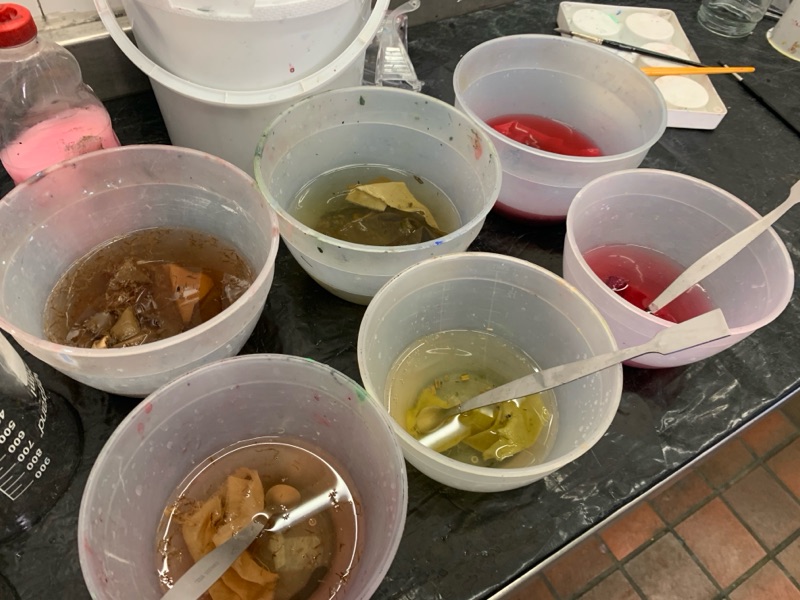
With hand-in drawing closer I found myself with some extra time to do some final dyeing without leaves and making pattern prints, but rather just testing colours. On-campus in the dye lab, we had several old leftover dyeing items such as nuts, cochineal (which I have researched earlier in this blog), safflower, goldenrod, and other natural colours. They range from bright yellows to reds and some browns but not any green surprisingly.
I got 3 pieces of silk, 3 wool, and 3 cotton. One of each fabric was copper mordanted, then one of each was allum mordanted and the last lot was mordanted with iron.
I chose to dye with safflower (orangey-brown) on the iron samples because the already beige fabric would potentially enhance the orange tones. Goldenrod (bright yellow) was the second choice that I paired with copper due to the blue tones to try and create a green colour. Lastly, I wanted to try the cochineal (red) to judge for myself if it is as effective as people say. I tested with the allum fabric which is white, so as not to disturb the pigment.
Results are in: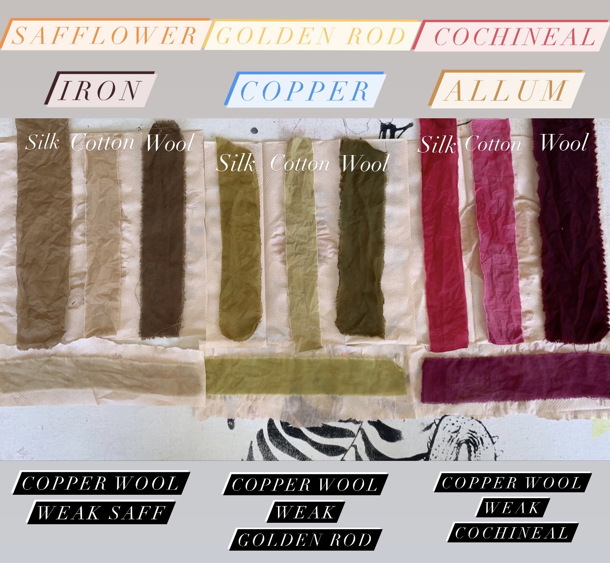
The method included weighing 5g fabric (bundle of wool silk and cotton) and then 2.5g of dye. I boiled each three dyes in beakers on Bunsen burners then left them simmering for 20 minutes. I then proceeded to add water to the 400ml mark and added the fabric, brought it to the boil again and simmered for an hour. The top 9 strips are the final results. I then used the leftover dye solutions to make weaker wool (treated with copper) to make some washed-out looking samples (pictures horizontally above).
Findings:
* The Safflower appeared to turn much browner than expected. Most likely due to the beige colour of the iron treated fabric.
* Cochineal was extremely pigmented and took the colour fast. Although I would prefer to use madder next time if I can get my hands on it - I loved the final effect!
* Wool took the colour best and richest colour, then silk, then cotton.
I love the idea of using the wool fabric for a winter kimono and that way the darker colour palette matches the season too, as well as the warmth. Then using the silk and the lighter colour palette for summer.
A very effective final sample that I did last minute due to spare time. I will be putting these samples together into a sketchbook for the final presentation. This blog and the experimental journey has been so rewarding and taught me many things I didn't know before about the industry I love. I will continue my research and develop these natural dye designs as an artist due to the personal interest it has sparked within me!
I'll keep the blog updated on my future endeavours!


Comments
Post a Comment